
“You have a very nice website. Beautiful design.” – A prospect said, looking at the clerk waiting to get appointed an agent to talk to.
With slight jitters, a prospect turned around to glance around the stylish company’s office and back again. The clerk interrupted her thoughts…
“Thank you. Our prospects often come here and let us know they really liked the website. The modish design and very modern look, they say.” (It was indeed) After taking a brief second to ponder her next question, the clerk presumes to ask.
“What’s the reason for your visit today, may I ask?”
“Oh, I wanted to know if there’s a shipping option outside the country,” Prospect said, continuing. “And if there is one, how much it would cost, and when the order should arrive.”
Looking to almost interrupt her at first, the clerk hesitates and never speaks the words: “You could have spared yourself a trip… We have that information listed on the website.”
Instead, she eats her words, smiles and nods at the client, and lowers her head in slight disappointment.
She thinks to herself “It’s the fifth time today already. I wonder how many decided not to come here…”
The Importance of Good UX Design
Explained in plain English – and to settle the moral of the story – the goal of UX is to deliver on users’ needs. By serving them a good and useful – not just beautiful – experience it should answer their most pressing questions. No confusion, with ease, and most importantly, with as few costly mistakes as possible!
To help you keep the sneaky errors at bay, we’ve put together a list of 7 bad design examples. Some are common, and some are just enlightening. But they all stack up to prompt you to consolidate your UX design efforts.
#1 Not making your CTA stand out
It’s no guess that call-to-action buttons play a vital role in users’ web experience.
Most pages nowadays have the end result of selling products, subscriptions or signups. Therefore, having a CTA that is easily noticed and frequently used goes a long way. The pain point lies in call-to-actions that are hidden on the page and are hard to notice.

It is wrong to sacrifice usability and conversions for the sake of aesthetic design.
Unbounce in one of their test studies decided not to take the leap of faith, but to test. They experimented with their PPC landing page’s CTA placement – whether they should move it further up or keep it as-is. Some clicks and hovers later, the results turned out nothing short of encouraging!
By making their CTA visible above the fold – and directing customers to scroll down the page to view the pricing grid – they saw a 41% spike in conversions.
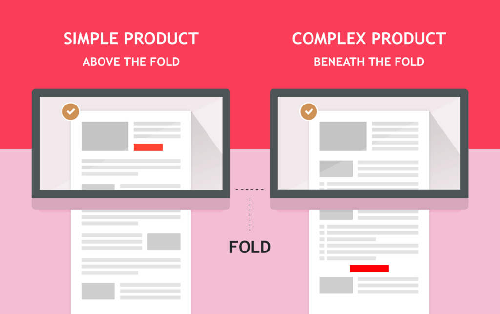
It goes to show that it’s absolutely lucrative to focus on improving your CTAs. Your visitors should not browse endlessly for the action button – but see it easily, and navigate to the landing or checkout page without the unnecessary hassle.
The fixes
- Place CTA above the fold and use vivid colors to make it visible
- Use actionable language, include a clear value proposition, and align CTA copy with what’s on the page
- Keep it short and sweet
#2 Making your users wait
UX design is not just about the visuals. In fact, above all else, it’s about convenience. Or, we dare say, it’s about prioritizing experience.
Speed is a big part of that experience. Just one tiny bit too long and you can rest assured a portion of your customers will wave you farewell.
In a 2019 survey done by Unbounce, as much as 70% of customers said that page speed impacts their buying decisions. Or rather, the lack of it. Moreover, as much as half reported they’d give up videos and animations for a smoother browsing experience. Plus, recent trends in SEO demand websites to improve their page speed if they want to stay afloat on search engines.
If you need more data to stop making this costly mistake in 2023, look no further:
- 53% of mobile visits are bounced if pages take more than 3 seconds to load
- A 2-second delay in load time results in abandonment rates up to 87%
- Models predict that companies whose mobile sites load in 5 seconds earn up to 2x more ad revenue than those with a site load time of 19 seconds
Why you may wonder, are we feeding you with so much data? Well, we want to spur you to take action because odds are, your company too is as guilty as charged.
Let’s start making web experiences efficient, accessible, and sleek. We all need it to experience websites at a glance.
The fixes
- Use the content delivery network (CDN) that work across various geographical locations
- Get a better and faster hosting service. If needed use virtual private servers and dedicated servers to notably improve website speed.
- Reduce the image sizes on your websites. Instead of heavy formats, use webp/webm types of files and make sure you convert them beforehand.
- Get rid of unnecessary plugins, JavaScript, and CSS files.
- Find other tried and true ways to boost your website speed
#3 “That was uncalled for!”
Letting users recover from errors is a good UX practice. Making them suffer their (corrected) mistakes, well… exact opposite.
Years of running heuristic analyses and gaining knowledge on best UX practices led professionals to a conclusion. They need to give users a safe and easy exit door when things go south.
Being in the know-how of this fact made likes of Mailchimp and Airbnb creme de la creme of the product design world.
However, many UX practices can turn out to be a two-edged sword – just like this one. It led WhatsApp to make a debatable move. Possibly a bad design that seems to annoy a good portion of their user base.
If you ever deleted your message on WhatsApp you sure got abashed in your seat at least once. No matter the reaction of other participants…. Why? Well, your friends saw you deleted a message. They assumed you sent something you regretted, intended for someone else, or felt bad for saying. And you… you assumed they assumed the worst. For some people, this internal dilemma that WhatsApp made possible doesn’t feel all too good.
Never mind the impression but the underlying question – that of whether you’re somehow frustrating your users – is not only applicable to chat services. It’s anywhere where you’re giving users feedback on their actions.
The fixes
- Run a usability or user acceptance test to determine whether a new feature is liked in the “real world”.
- Give users the option to timely recover from their mistakes without any ill effects. Maybe the way G Drive has done it…
#4 Forcing users to prove their humanity
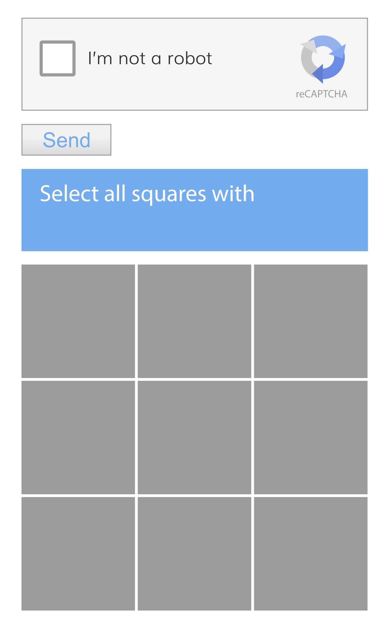
“Show us a picture and we’ll show you a stop sign.”
Something all of us – and against our own will – were trained to do with eyes closed.
Drop any 21st-century human in a concrete jungle and he’ll easily spot bridges, parking signs, traffic lights, and even boats. The skill we never wished upon but claimed anyways. The odds are, at this game, we’ll even beat the robots we unknowingly trained while confirming that we’re not affiliated with one. Ironic isn’t it?“Opportune or needed” at the expense of “frustrating” is not one of the good interaction design principles. However many web pages – not just Google – are still head-deep in this practice. It’s important to understand that Google enjoys the privilege of being Google. Other companies emersed in a competitive race for users? Well, there’s no such privilege…
The fixes
- Run CAPTCHA alternatives that won’t baffle users: gamified CAPTCHA, simple question, a slider or checkbox, honeypot single-question form
- Use multi-factor authentication
- Go for advanced bot protection solution like DataDome
#5 Not letting users settle on a password
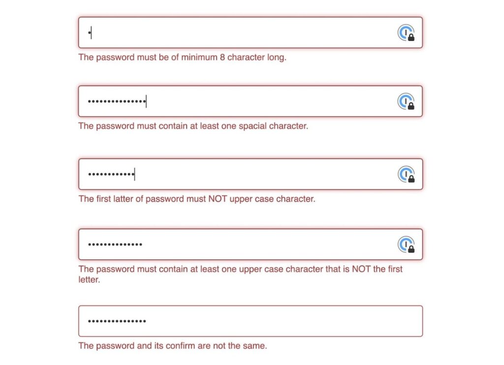
Indeed, a common practice is to require:
- A minimum of 8 characters
- A mix of letters and numbers
However, forcing users to comply with the requirements – maybe not the best idea.
We advise people to take water on a hiking trip, to use blue light protective glasses, and to separate passwords for different accounts. But we don’t force them, right?
With many advancements in web security – multi-factor authentication being just one – the need for a strenuous password checkup is slowly diminishing. And with companies not letting go of tiresome ideas, their users end up requesting password restart more times than they can remember.
The fixes
- Use password alternatives such as PIN codes, OTP, biometrics, or magic links
- Advise your users to use passphrases when creating passwords. These intuitive words are easy to remember and good for security as they are pretty hard to crack.
#6 Making it hard for users to part ways

This is one UX practice that just doesn’t want to evaporate that easily.
Boring or shaming your users to quit unsubscribing might seem like a smart maneuver. After all, if it bears fruit and if other big brands are doing it, why quit the practice? Let us assure you though – forcing users to find a needle in a haystack is not a good practice. Especially if that needle is something they really need to find.
Such methods are applied too often because companies are measuring their success in short-term metrics. Metrics that, if tricked to a peak, seemingly provide a quick win for digital products or services. Way too often do companies forget that real people stand behind the cursors. When treated like numbers, they often fire back in a condemning voice. This in turn negatively affects long-term brand integrity.
Remember, it’s not about the quick wins but sure wins. Forcing your customers to look high and low, or to explain their reasons first – and in detail – will only contribute to them disliking your brand (even) more.
Rest assured that most of your users don’t feel like doing the following:
- Having to justify unsubscribing from the newsletter
- A popup that tricks you into reading so you can click on “Yes or No”
- Hiding an “unsubscribe” option deep in the account or membership settings
- Naming “unsubscribe” action by unconventional names so users can’t find it
The fixes
- Never ask questions as a requirement to complete the form even if it’s of vital importance
- Help users navigate to all website sections as easily as possible
- Run usability tests on the unsubscribe process
#7 Creating a web clutter
Trying to accomplish a single goal – good design.
Trying to reach too many finishing lines all at once – bad design. And a recipe for web clutter – that bombed-to-your-core feeling you get when you visit stuffy websites. You know, endless dropdown menus, dancing images, flying pop-ups and widgets, sliders, etc. A Hogwarts scene more so than a website… It all adds up to cause one big, though well-intended, mess.
To prove a point – that of making sure you’re accomplishing just a single goal – we’ll share a case.
A study from AmeriFirst Home Mortgage demonstrates the importance of a simple, distraction-free landing page. The company implemented a policy of “naked” landing pages, or pages with no navigation, that ultimately resulted – according to Relevance – in a conversion rate increase of 30-40%. They simply freed users from excess thinking and served their best meal.
Steve Jobs famously said that at the heart of the design is an understanding of what humans guess and desire. In this case, it’s clear that people guess in favor of simplicity.
This tried-and-true design principle is essential for effective UX. By removing distractions, their minds are relieved from feeling overwhelmed. They can effortlessly focus on the task at hand. And when it comes to optimizing your web experiences, a little simplicity always comes in handy.
The fixes
- Use more negative and free space
- Decide what’s the page-critical content and focus on delivering just that
- Apply some design tricks. Increase horizontal and vertical space between the sections. Increase the paragraph line heights
- Choose your color palette and stick to it
Similar insights

How To Know If Your Business Is Ready To Scale Internationally
21/01/2026
8 Hybrid Commerce Mistakes Companies Repeat in 2026
13/01/2026
Smart Workflows: AI Tools and Tips for Busy Leaders
16/12/2025
Supply Chain Attacks: Rethinking Third-Party Trust
10/12/2025
Choosing the Right Tech Stack in Uncertain Times
25/11/2025
How to Pitch and Get Your Ideas Approved at Work
12/11/2025
12 AI Cyberattacks That Made CEOs Very Cautious
21/10/2025
14 Books Smart Tech Leaders Are Reading This Fall
07/10/2025
Protect Your Crown Jewels: The Heart of Your Cybersecurity
15/09/2025
Let the success
journey begin
Our goal is to help take your organization to new heights of success through innovative digital solutions. Let us work together to turn your dreams into reality.